So far in the analysis of composition we have been speaking of flat plane arrangements; we have been seeing the world in 2D, so to speak. And although, strictly speaking, an image (whether printed on paper/canvas or displayed on screen) is essentially 2D, the scenes it represents are from the 3D real world of experience. Hence, there are certain unconscious expectations on our viewing an image.
Generally speaking, the notion of depth in composition is concerned with foreground and background. In some context, even middleground could be employed as a term. However, I personally consider it an unnecessary complication, as if we need to divide a photo into three distinct depth layers, where is the subject in all that?
It is perhaps easier to understand with an example:
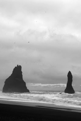
In the photo above, there is a foreground: the small portion of sand showing at the bottom of the frame. There is also a background: the overcast sky. But ask yourself: Can we really speak of a middleground here? I would argue that no, not in any practical terms. To claim that the rocks in the sea are the middleground is an unnecessary tautology, as the rocks are the subject of our photo!
And if you argued that "hey, what if the subject is in the foreground area?", or "what if the subject is the entire vista?", then let's consider another example:
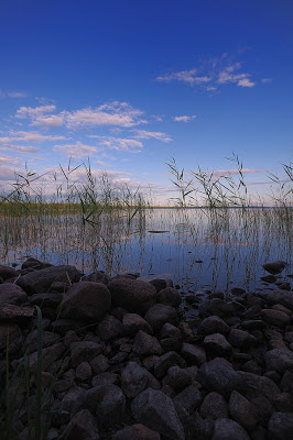
Here we have several elements: the rocks, the lake with the vegetation, and the sky. The subject of the photo, however, is the rocks*. It would be tempting to separate the depth into three zones, fore-, middle-, and background (and technically nothing wrong, really, with doing that), but ultimately, it doesn't serve a purpose. The rocks are in the foreground and are the subject. The rest, lake and sky alike, are the background - notice that it becomes easier to group lake and sky together due to the fact that the latter is reflected on the former; they are essentially identical in terms of hue and luminosity.
* You could argue it's the entire vista, but I think the low and ultrawide angle of the shot, together with technical aspects of it (such as plenty of detail in the shadows) clearly show the rocks are given subject status.
So, if we have foreground and background, what kind of analysis can we make, what kind of conclusions can we draw, and how does that help us? Well, things are very simple - and yet infinitely complex ;)
Basically, what we said about relations between frame elements also applies here. In other words, think of the foreground and the background as two large element groups, the expressive weight of each being something that should be taken into consideration.
In the photo above, with the rocks in the foreground and the lake/sky in the background, we have:
- a foreground where the main subject is located. The foreground is darker and less saturated, but it still has good detail.
- a background which is brighter and much more saturated, with some contrasty elements (i.e. vegetation and clouds).
What do all that mean? Again, you tell me! Meaning can be implied by the author, but is not set in stone. For me, the fore- and background tension (bright vs dark; dull vs saturated), together with the fact that the subject is in the least "eye-candish" part of the frame, underline a latent tension in this deceptively peaceful scene.
In many ways, composition is about balance - but beware! I didn't say about keeping the balance. Sometimes this is what is required. Others, distorting the balance is the key to a successful composition. In the example photo above, had the foreground been darker, throwing away the detail, we would have an almost featureless foreground - without any shadow outline. The subject would have been the whole vista (with a weird-looking dark foreground). Would it have been a more balanced composition? Forgetting about the dark foreground, yes. The subject would be bright, saturated, and pleasing to the eye. Also, it would have made a very boring composition.


No comments:
Post a Comment